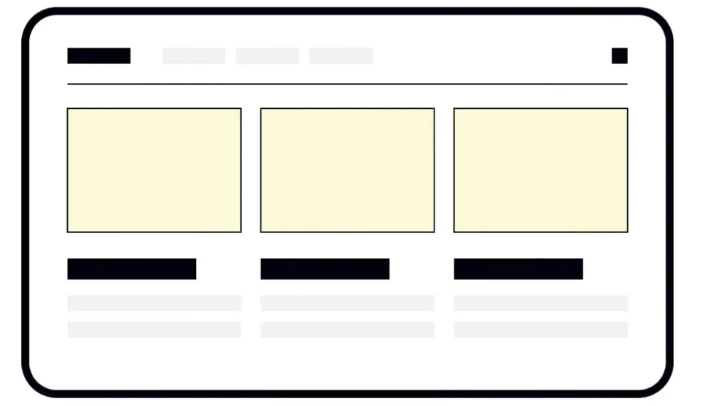
Nowadays, users can access information from a large number of devices. Designers should catch up with this diversity and cater to various screen sizes. When designing, they have two options – adaptive design and responsive design.
Both methods aim to address the same issue – allowing users to access content from any device, screen size, browser, or operating system. However, responsive and adaptive design seem to be better solutions for different scenarios. To make the right choice, you should consider the type of content, user needs, project budget, and sometimes customer requirements or technical limitations.

Responsive design
Responsive design is a method of adjusting designs to various screen sizes. In short, the design will shrink or expand according to the screen size, allowing users to access information from any device in the most convenient way. As the name suggests, responsive design responds to changes in browser size and adjusts layout elements to accommodate available screen space.
At first glance, responsive design seems to be the most direct and cost-effective solution. Developers use CSS media queries to define breakpoints based on specific device classes. However, the diversity of devices, screen sizes, operating systems, and brands may turn this process into a nightmare. Designers should define breakpoints and control the appearance and alignment of elements across multiple devices based on content and user needs.
Adaptive design
Through adaptive design, we have multiple fixed layout sizes and choose the most suitable one for the available screen space. The adaptive design method is more expensive and time-consuming for UI/UX designers, as it requires developing six designs for the most common screen widths (from very small to very large): 320px, 480px, 760px, 960px, 1200px, and 1600px
You can optimize the team’s work by referring to the network analysis of existing website versions. It allows you to determine the most common screen size for users to access your website. You don’t need to design for all 6 screen widths, you can optimize the user experience only for your favorite 2 or 3 screen sizes, which is enough.
The most important advantage of adaptive design is that you don’t have to worry about incorrect alignment and display of elements, and it can ensure that users can get the same experience on any device.
Through adaptive design, designers can customize the best user experience for the most popular devices in their target audience.
Control mobile layout
The adaptive design method means designing several fixed layouts. Designers don’t need to worry about the arrangement of elements when the screen size changes. For example, when a user opens a website on a tablet or phone, the website will adopt the best layout suitable for the screen without affecting individual design elements.
On the other hand, we are unable to create designs for all types of devices and screen sizes, and if users open websites on uncommon screen sizes, designs may not display correctly. In this case, responsive design can adapt to websites with a wider screen size. The disadvantage of this method is that it requires more coding and testing to ensure that your website is delivered as expected.
The similarities between adaptive and responsive design
When it comes to responsive and adaptive design, we often pay attention to their differences. But they also have some commonalities. Both responsive and adaptive websites will change their appearance based on the browser environment.
The difference lies in the nature of these changes. In short, responsive design is smoother and allows for smooth adjustment of website layout (and sometimes functionality) in any width change. This method is very flexible and aims to create an optimized experience for any screen. Responsive design requires designers to be more cautious in selecting UI components that can adapt to different screen sizes, using percentages as relative units of measurement, and relying on media queries to define primary and secondary content breakpoints.
On the contrary, the characteristic of adaptive websites is agile behavior, using different fixed layouts when the screen size changes. If designers neglect to provide layout for less common devices, such as tablets, it may deprive some users of a good user experience. Generally speaking, adaptive design is not very popular, expensive, and challenging for SEO.
